Enhancing patient adherence through specialized pharmaceutical package design requires careful color measurement to optimize safety and usability. Image Source: Flickr user Steven Depolo
Packaging color plays an integral role in shaping consumer perception of pharmaceuticals. However, it is also making medication use easier and safer for patients by affecting not just which medications they take, but how they take them. The World Health Organization reports that 50% of people with chronic illnesses do not take their medication as prescribed, leading to preventable hospitalizations, creating undesirable health outcomes, increasing mortality rates, and “incur[ring] costs of approximately $100 billion per year.”1 While non-adherence is not a new issue, heightened awareness of the problem is spurring pharmaceutical companies to turn to specialized adherence packaging to facilitate proper medication use for both prescription and over-the-counter drugs. Producing effective adherence packaging relies on thoughtful design that encourages correct use as well as precise color measurement to maximize efficacy, user-friendliness, and safety.
Causes of Non-Adherence
The reasons for non-adherence are multiple and complex, but some common factors include misunderstandings regarding dosing instructions, confusion regarding use, and simple forgetfulness.2 The problem is particularly pronounced amongst people who take multiple medications, require multiple daily doses, have cognitive impairment issues, or have difficulty reading or understanding printed instructions. Elderly populations face increased barriers to adherence while also experiencing heightened vulnerability to negative effects brought on by incorrect drug usage.

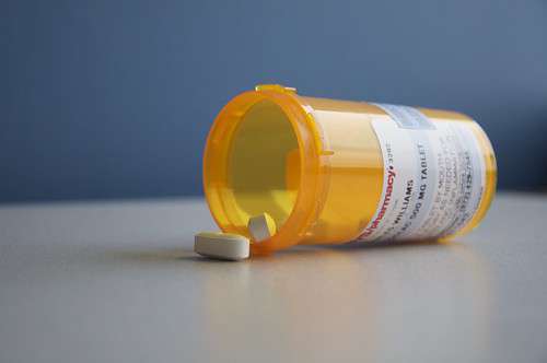
Standard prescription bottles can increase patient error and inhibit adherence, keeping consumers from experiencing the full benefit of medications. Image Source: Flickr user Charles William


