Using the Color of Product Packaging to Change Smoking Behavior
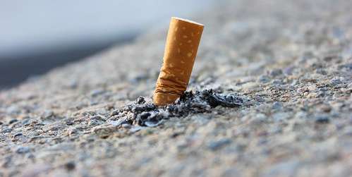
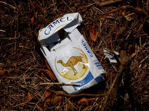
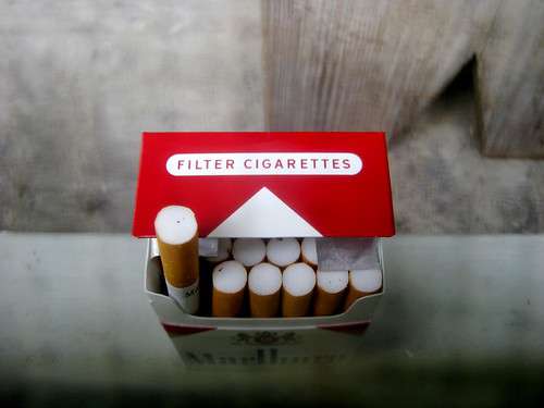
While Pantone 448C is making headlines currently due to new legislation, such coloration has been used in standardized Australian cigarette packaging since December 2012, giving researchers an emerging but intriguing glimpse into the potential product packaging color has to change both attitudes and behaviors. According to 14 Open Access studies, “standardized packaging reduced the appeal of smoking and of cigarettes themselves, encouraged smoking cessation and made the health warnings more prominent.”3 These real-life observations “support those observed in the laboratory studies and surveys conducted prior to the implementation of standardized packaging.”
But changing hearts and minds is one thing; changing behavior is quite another. The real question is whether the “human waste” colored packaging changes the number of people who smoke. Olivia Maynard, Senior Research Associate at the University of Bristol, writes:
Although the prevalence of smoking has been in decline in Australia for some time, an Australian government report shows that this decline has accelerated since the introduction of standardized packaging. It is estimated that standardized packaging is directly responsible (after taking into account other factors such as tax increases) for 25% of the 2.2% drop in smoking prevalence observed in the 36 months after the introduction of standardized packaging as compared with the 36 months before. This may not sound like a lot, but this is equivalent to 118,000 fewer Australians smoking as a direct result of standardized packaging. Given that two-thirds of smokers are expected to die from diseases caused by tobacco use, this is a clinically meaningful decline.
These findings are significant both in their implications for public health as well as for understanding the impact of color in product packaging overall; after all, most smokers are under no illusion that smoking is an attractive, healthy habit and it would be disingenuous to believe that new smokers take up smoking because they have not been informed of its effects. As such, it is unlikely that the standardized packaging introduced new logical information that caused smokers to reconsider their habit or made would-be smokers decide against taking their first drag. Instead, the packaging reaches people on a more visceral level and begins to unravel decades of some of the most successful product marketing the world has ever seen.
HunterLab Color Measurement
At HunterLab, we understand the extraordinary power of color psychology in product packaging. For over 60 years, we have devoted ourselves to the science of color measurement to help our customers develop and produce their chosen colors accurately and consistently, regardless of packaging material or manufacturing location. We offer a full range of portable, benchtop, and inline spectrophotometers and customizable software packages that allow you to monitor color at every stage of the production process, optimizing your ability to create the message you want and take full advantage of the unique ability color has to speak to customers. We invite you to contact us to learn more about our renowned spectrophotometric instruments and how we can help you take your color management abilities to new heights.