Agera L2: Next-Gen Color Confidence for Packaging Color Consistency
HunterLab's Agera L2 spectrophotometer delivers the precise color measurement technology packaging manufacturers need to create and maintain iconic brand identities in an increasingly competitive marketplace.
Color Precision for Brand Integrity
Your consumers are viewing your packages in different settings than exist in your manufacturing facility. The Agera L2 is engineered with reference-grade 0°/45° circumferential geometry that replicates human color perception.
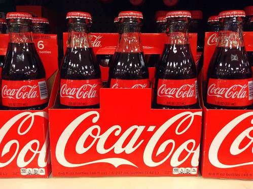
This spectrophotometer/colorimeter also offers a specialized Dark Performance Mode, empowering 6x the measurement precision on samples with less than 20% reflectance — perfect for packaging elements from the deepest blacks and purples to the darkest grays, browns, and blues.
Plus, Agera L2 features certified Grade ‘A’ CIE D65 source illumination, which is ideal for establishing a standard, controlled baseline for color evaluation. D65 Source Mode captures appearance under D65 daylight conditions, so results are closer to how the human eye judges color in daylight. This design simplifies color measurement in packaging that contains optical brighteners, fluorescent inks, or special finishes, since daylight naturally contains UV energy.
Total Appearance Measurement for Premium Packaging
Variations in surface texture, substrate patterns, and gloss levels affect consumers' perceived color. Even with the same red ink formulation, a high-gloss surface may appear darker than a heavily textured surface. In these cases, 0°/45° geometry is especially important because it is designed to better represent total appearance.
This spectrophotometer/colorimeter includes advanced features that allow manufacturers to quantify total appearance by accounting for the influences of a sample's physical properties. The device boasts 4x to 16x the surface-area measurement of competing models, simplifying sample averaging for high color confidence. Our next-gen Agera L2 also features simultaneous 60° gloss capture in a single measurement.
Production Efficiency for High-Throughput Manufacturing
Packaging is a high-volume application where maximum efficiency is paramount.
HunterLab's Agera L2 is built to deliver day-one improvements. This spectrophotometer integrates easily into existing workflows facilitywide, from raw materials in receiving to end-of-production inspections. The device's simple-to-learn interface and one-touch operation help reduce training curves, while a built-in camera with sample preview encourages accurate, consistent presentation to minimize discrepancies. Readouts take less than 3 seconds, keeping throughput high and supporting fast color-quality decisions.
Onboard Easymatch Essentials L2 software and connectivity further increase efficiency. Our user-friendly platform enables self-contained color workstation functionality, so operators can analyze data directly on-screen without additional PC hookup. Convenient HDMI ports support a monitor connection, while USB ports let you add a keyboard, mouse, or external drive for data export. We've also included Ethernet ports designed to simplify data sharing directly with SPCs and LIMS.
Support for Global Brand Color Consistency
Global brands need effective ways to uphold color consistency and regulatory safety in packaging, no matter where it's produced. Agera L2 makes it easier to achieve with features that increase lifetime value:
- Data security: Protect data integrity and create audit-ready documentation with user-based access controls.
- Built-in color library: Quickly compare your readouts against industry-standard scores, scales, and indices such as Y brightness and Whiteness Index for paper-based packaging.
- 32GB of storage: Easily store and access up to 4 million historical results with images to analyze historical trends and document that results meet established tolerances.
Durable construction: The Agera L2 features sealed optics and rugged housing designed for reliable, long-term performance in demanding production environments.
HunterLab Quality
HunterLab has been at the forefront of spectrophotometric technology for over 70 years. Today, our comprehensive lineup of portable, benchtop, and in-line instruments plays a critical role in the development and manufacturing of packaging materials, giving you the ultimate in color quality control. With the help of HunterLab’s cutting-edge spectrophotometers, you can truly harness the potential of color to optimize your chances of success, whether you’re updating the look of existing items or introducing new products to the marketplace.
Contact us to learn more about our innovative technologies and world-class customer support services, and let us help you select the ideal spectrophotometer/colorimeter for your needs.