
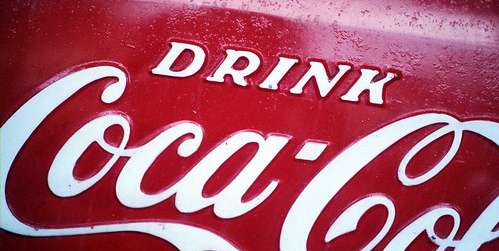
The iconic white and red ribbons of Coca-Color is perhaps the most successful example of logo branding in history. Image Source: Flickr user Steve Snodgrass
When I think of iconic brands, the first thing I imagine is their logo. More specifically, I imagine their logo color—the white and red swirls of Coca-Cola, yellow arches of McDonald’s, the gold crown of Rolex, the simple blue square of Facebook. Logo colors speak to us, telling us a story about the brand, about values, and about identity. Tangerine’s distinctive orange, for example, sets it apart from the blues, greens, grays, and blacks of more traditional financial institutions, suggesting a youthful energy while paying homage to its Dutch roots. The Starbucks logo was originally brown, but when the company merged with Il Giornale they dropped the “tradition-bound” hue for a more “affirming” green.1 Some colors become so deeply connected to the identity of a brand that merely a glimpse of the hue calls to mind the rich history of company. The robin’s egg blue that serves as the background for Tiffany’s name printed in plain black has become so intrinsically linked to the brand that it is now known all over the world as Tiffany Blue, symbolizing “elegance and exclusivity.”2
Brands are increasingly coming to understand the importance of sensory marketing, with many investing in methods that appeal to consumers’ bodily sensations to make vital connections between emotions and products. The power of color, in particular, to draw customers is well-documented: 84.7% of consumers say that color is their primary reason for buying a particular product and 80% believe that color increases brand recognition.3 The importance of color extends not just to the product itself, but to the logo, whether it is incorporated within the product, packaging, retail environments, websites, or in advertisements. In fact, the logo may be more powerful than any single product, as it stands in for the company as a whole and sets the mood for consumer encounters across media. By drawing on our pre-existing psychological lexicon, color can be deployed to invite particular reactions and inform relationships with consumers, acting as chromatic symbols of a brand’s priorities and behaviors from the first glance. As such, market researchers and designers spend considerable time, effort, and often money finding the perfect hue to represent their brand and project their desired image into the world.

The distinctive Starbucks logo is so firmly associated with the company that we can immediately identify the brand with only a glimpse. Image Source: Pexels user Adrianna Calvo