The effects of moisture on color measurement are all too real for manufacturers. Wet samples can appear dramatically different from their dry counterparts — darker, more saturated, or with altered surface properties that can cast doubt on result accuracy. This reality creates a dilemma for quality control (QC) teams in many industries. Do you wait for samples to dry and slow throughput, or measure wet samples and risk inaccuracies?
Understanding how sample moisture content can affect color can help you pivot to a more predictable framework that addresses the variable. With spectrophotometry, you can build reliable measurement protocols that transform wet samples from obstacle into QC advantage.
Why Does Moisture Change a Sample’s Appearance?
Moisture settles into air gaps on a sample's surface, or — in the case of textiles — becomes absorbed by the fibers. Both cases can impact how light interacts with the surface and influence the sample's appearance.
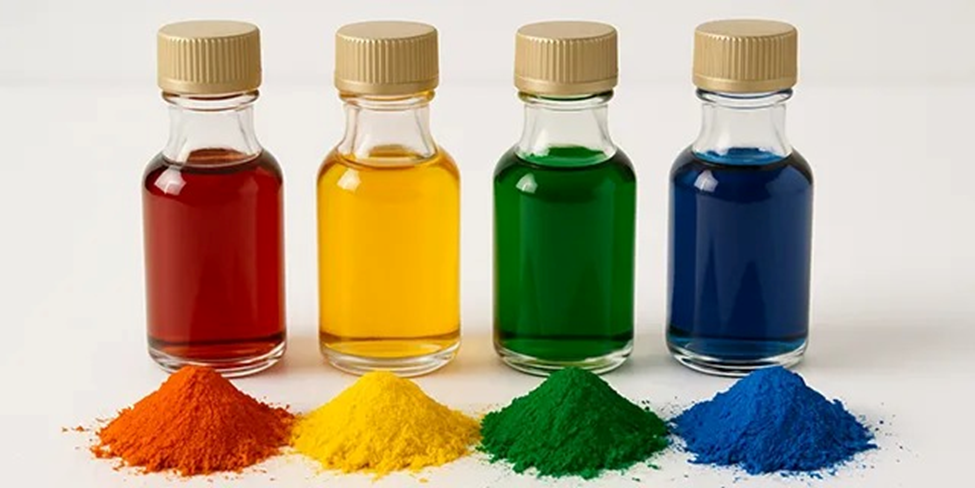
In the simplest terms, wet samples will often appear darker because there is less light scattering and more light absorption. The more moisture-saturated the sample is, the more pronounced the perception shift can become, with highly porous materials often showing the most dramatic effects of moisture on color measurement.
How Does Moisture Impact Different Materials?
This phenomenon can manifest in different ways in key industries.
Powders and coatings present issues with color measurement when moisture is present. Structural clumping is a common concern, and the particle aggregation can cause light scattering that impacts appearance. This clumping can also create issues with sample flowability and further impact data consistency and repeatability.
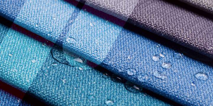
Absorption is the primary challenge with textiles, reinforcing the need for accurate sample preparation. The type of fabric also makes color measurement more complex in wet samples. For example, cotton and polyester have vastly different absorption capabilities, so color alterations may appear much more pronounced in one than the other.
What Are the Business Costs of Uncontrolled Moisture Variables?
Uncontrolled moisture variables add measurable costs that affect your bottom line through reduced efficiency, increased waste, and elevated quality risks.
Production Bottlenecks
You know downtime is expensive. When your production line stops to wait for samples to dry for color measurement, it creates delayed quality decisions and scheduling backlogs. The end result? Throughput and efficiency suffer.
Consider the cascading effects of a single wet sample that requires 30 minutes of drying time. It pushes back every subsequent sample in the queue. Lab technicians stand idle, production managers scramble to adjust schedules, and quality decisions that should take minutes stretch into hours.
The ripple effects extend beyond the lab. Manufacturing lines may continue producing potentially off-spec product while waiting for color approval, creating inventory that might need reworking or disposal. Meanwhile, shipping schedules slip and customer commitments become harder to meet.